Delille Cellars
Website Case Study
DeLille has risen to be one of the most recognized, accessible, and loved wineries in Washington State; they wanted a website that reflects just that!
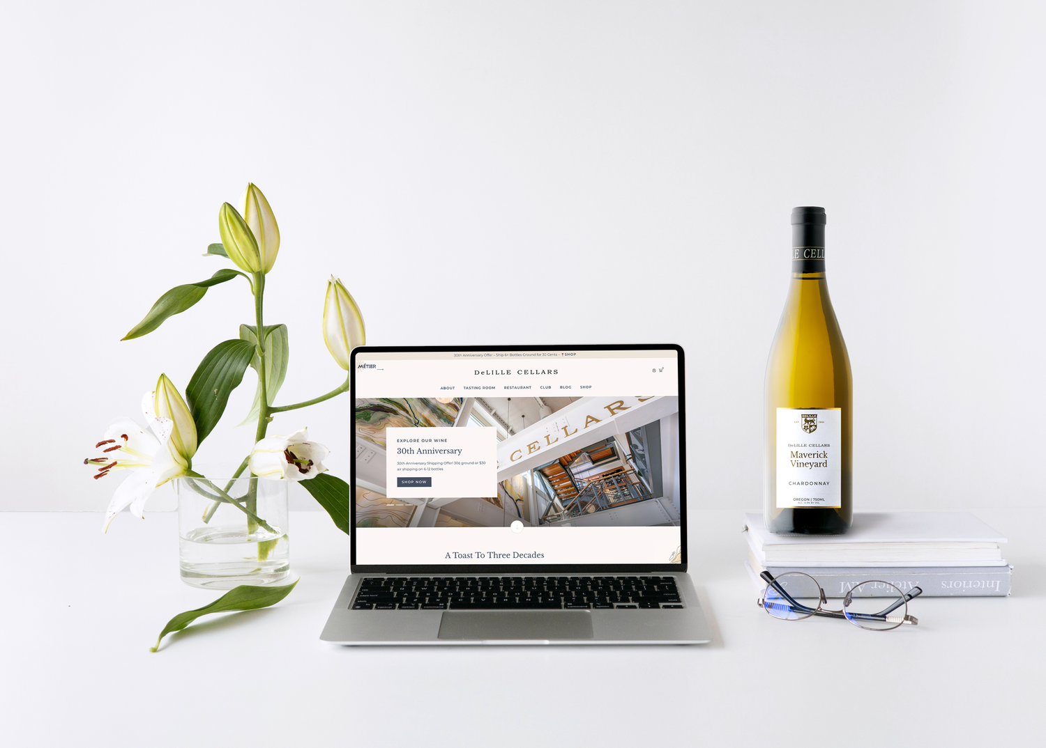
We’ve also elevated our vineyard partnerships and blog through the new design, as well as modernizing calls to action for visitation to both our tasting room and restaurant. This is only the beginning, and we look forward to further site enhancements and continuing to tell the story of our winery’s 30-year history in this dynamic digital age.
Keri Tawney, Director of Marketing, DeLille Cellars
THE PROBLEM WE WERE HIRED TO SOLVE
DeLille Cellars did not have a website worthy of their brand. It was managed through WineDirect’s content management system and their team found it hard to edit and control. The site lacked a modern aesthetic and felt stale.
They hired our agency Highway 29 Creative to partner with them to design a new website on Wordpress that integrated WineDirect’s cart. Their goal was to have maximum flexibility to manage and edit the website themselves. We worked together to map out their top conversion goals and create a sitemap that was easy for users to navigate. DeLille has a restaurant on property and needed to balance wine e-commerce with on-site visitation.
Homepage
THE MOST IMPORTANT QUESTION IS “WHY?”
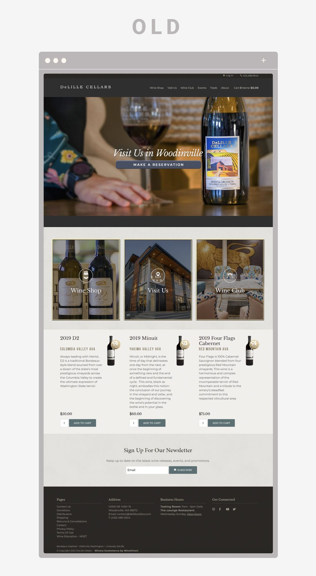
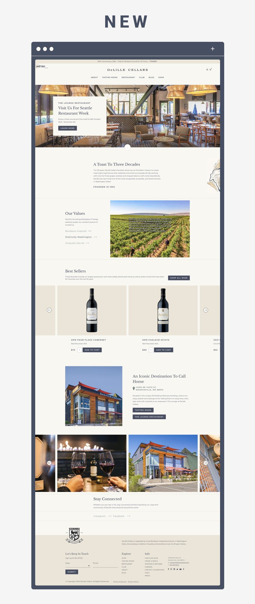
Their old homepage showed what DeLille Cellars was, but didn’t explain the “why” behind the brand. Too many winery websites make the same mistake of having a simple hero image and then three boxes with links to other pages. Consumers today expect more from a homepage. They are hungry for a storytelling component and want to know what a brand stands for.
We worked with their fantastic team to create a new, modern aesthetic for the website with brighter colors and contemporary fonts. The new homepage introduces the brand to users, provides a summary of their “why” and then calls the user to action. Right away we display the best selling wines and give options for visiting the property.
Shop
E-COMMERCE DRIVEN DESIGN
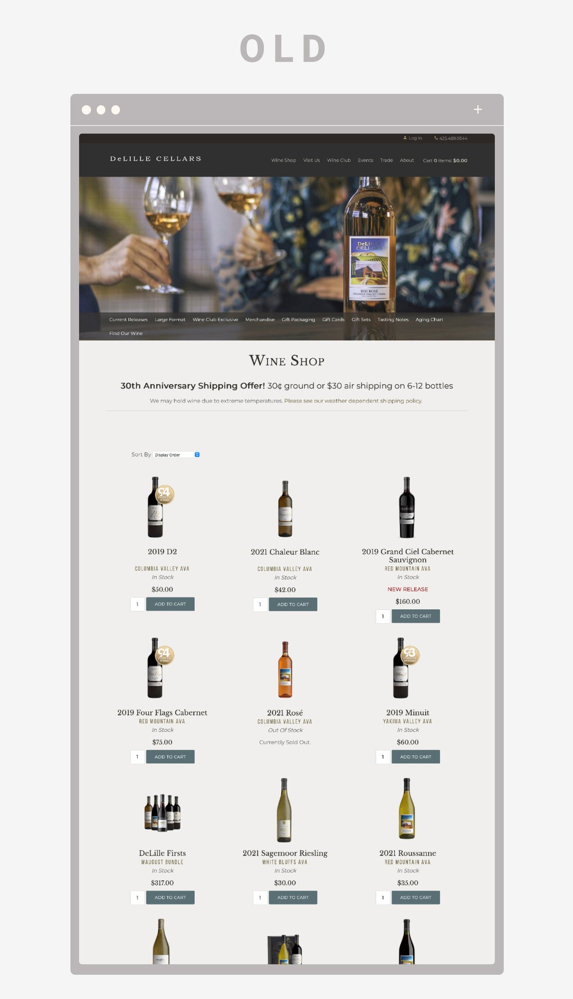
The old website did not have a clear user journey. The users had to scroll far down the page to discover which wines were for sale. The sub-navigation was difficult to read overlayed on the hero image. Bottle shots were small and hard to discern.
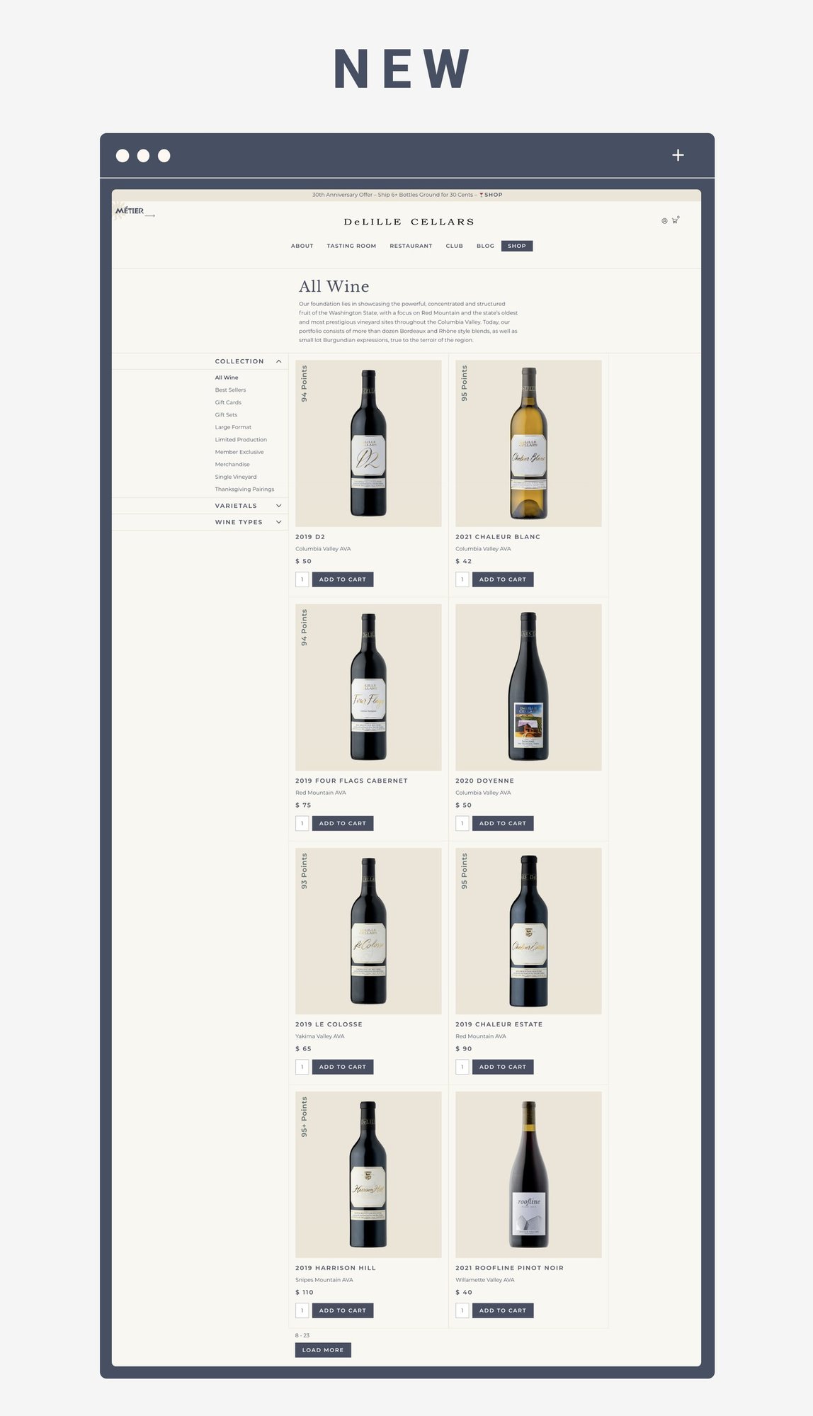
The new shop for DeLille Cellar’s website is clean and inviting. Right away users are greeted with bottles of wine above the fold. We move the sub-navigation to the left side of the page where customers expect to find it. We broke up the options into major categories so users can easily navigate to find the wine they are looking for. User experience research studies prove that when users can find the product they are looking for faster through categories or filtering, they are more likely to convert.
Product Detail Page
ASK FOR THE SALE AND DON’T BURY THE LEDE
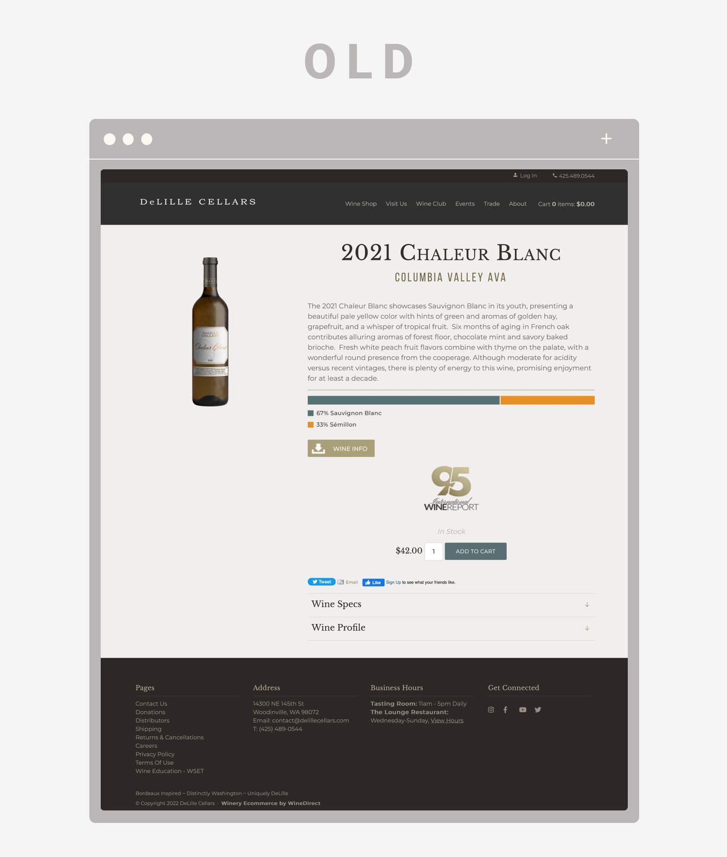
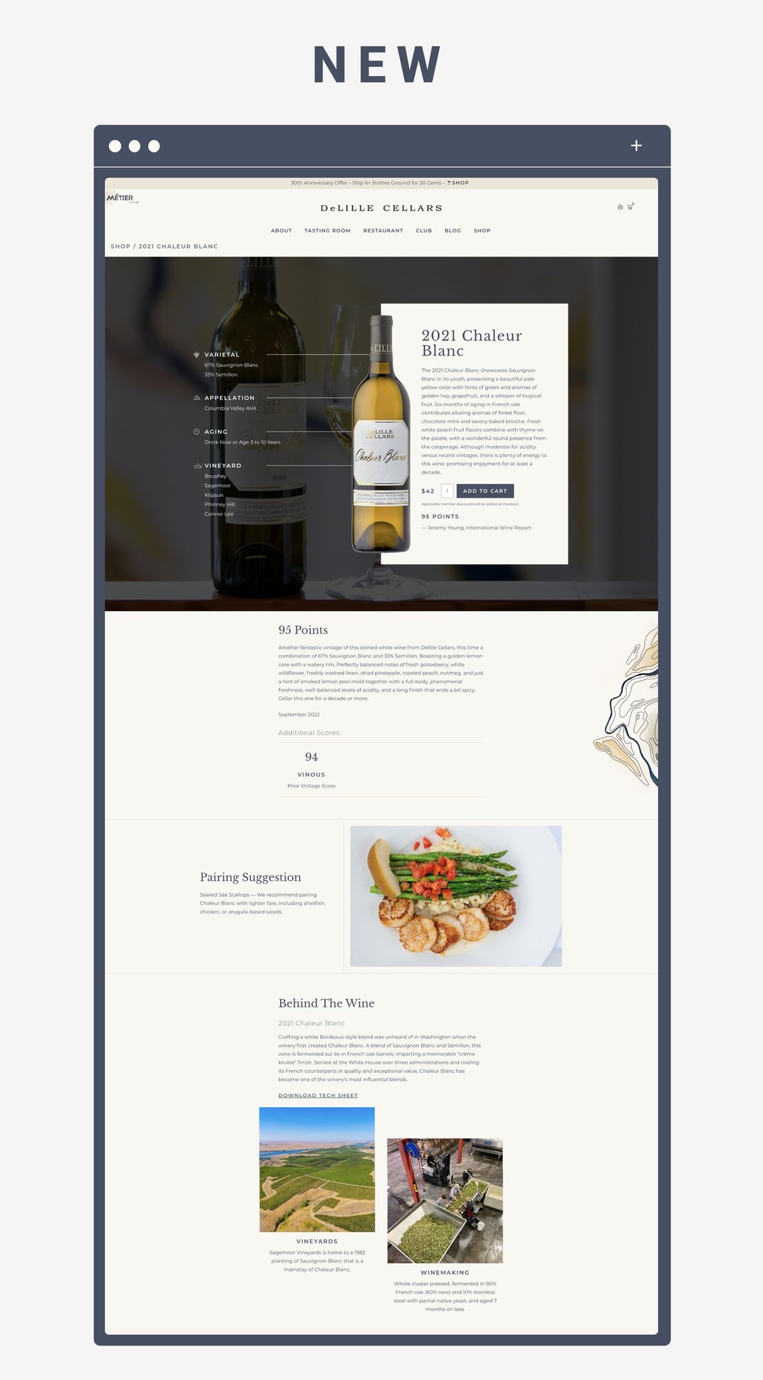
The old product detail page hid the most important elements– the price and add to cart button! Users had to scroll far down the page to buy the wine. We redesigned the page to ensure the call to action was above the fold and stood out.
Our philosophy at Highway 29 Creative is to create product detail pages that provide a rich experience equal to the tasting room. Too many winery websites only have a bottle shot, tasting notes, and the price. They fail to create an immersive and educational experience to sell the wine. We worked with the team at DeLille to identify content they could produce for each wine. We built new sections on the product detail page including reviews, pairing suggestions, and a chance to learn more about the vineyard source and winemaking.
