Joseph Phelps
Website Case Study
We were honored to be selected to help Joseph Phelps Vineyard embark on their next chapter. They had outgrown their old website and were transitioning from AMS to Commerce7 all in the midst of a full acquisition by LVMH. Their team was looking for a partner who could bring their rich fifty years of history to life in a digitally native, modern, and luxurious way. We are pleased to share the results with you.
“Joseph Phelps was one of the great visionaries of Napa Valley. His legacy is one of extraordinary quality.” — Robert Parker
Kristine Mason, Senior eCommerce Manager, Joseph Phelps Vineyard
THE PROBLEM WE WERE HIRED TO SOLVE
They wanted to be able to create a seamless UX between all of their digital properties with a focus on conversion rates for online shopping, reservation booking, and wine club sign ups. Their current site had a confusing one page homepage with a significant bounce rate, leading to high site abandonment.
A new site presented the challenge of distilling a rich fifty year history into a clean and easy to navigate website that did not overwhelm the user and instead guided them to conversion.
Homepage
FIRST IMPRESSIONS MATTER. STORY TELLING IS KEY.
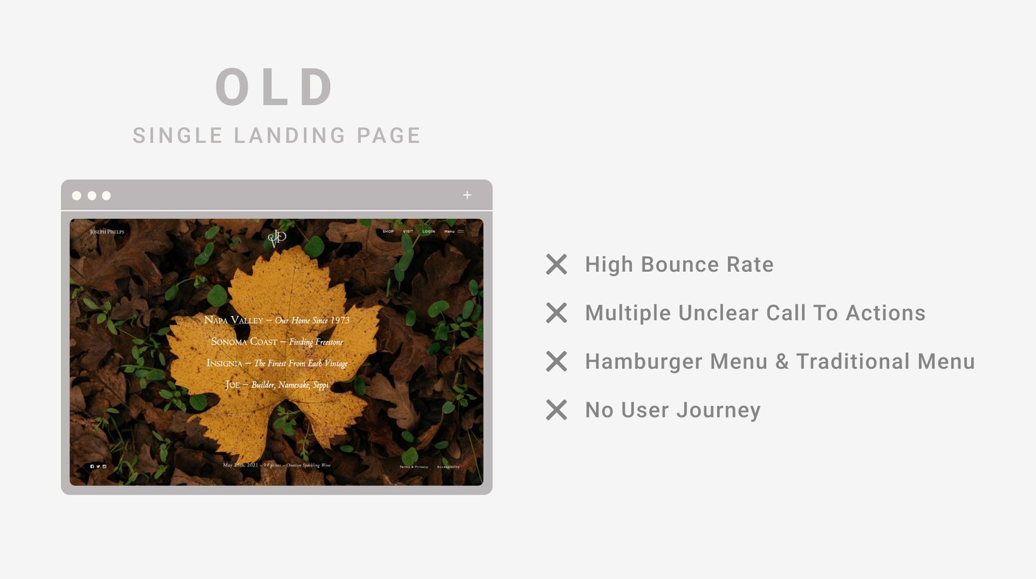
The old homepage was confusing to navigate and had little SEO value. It was a single full screen image with four links with difficult to discern names. Many users would get to the homepage and abandon the site unable to find what they were looking for. A lack of text on the page led to poor SEO and a weak first impression. Users were required to click through the site to find what they were looking for. Most importantly, it lacked a clear call to action “CTA” leading to low conversion rates.
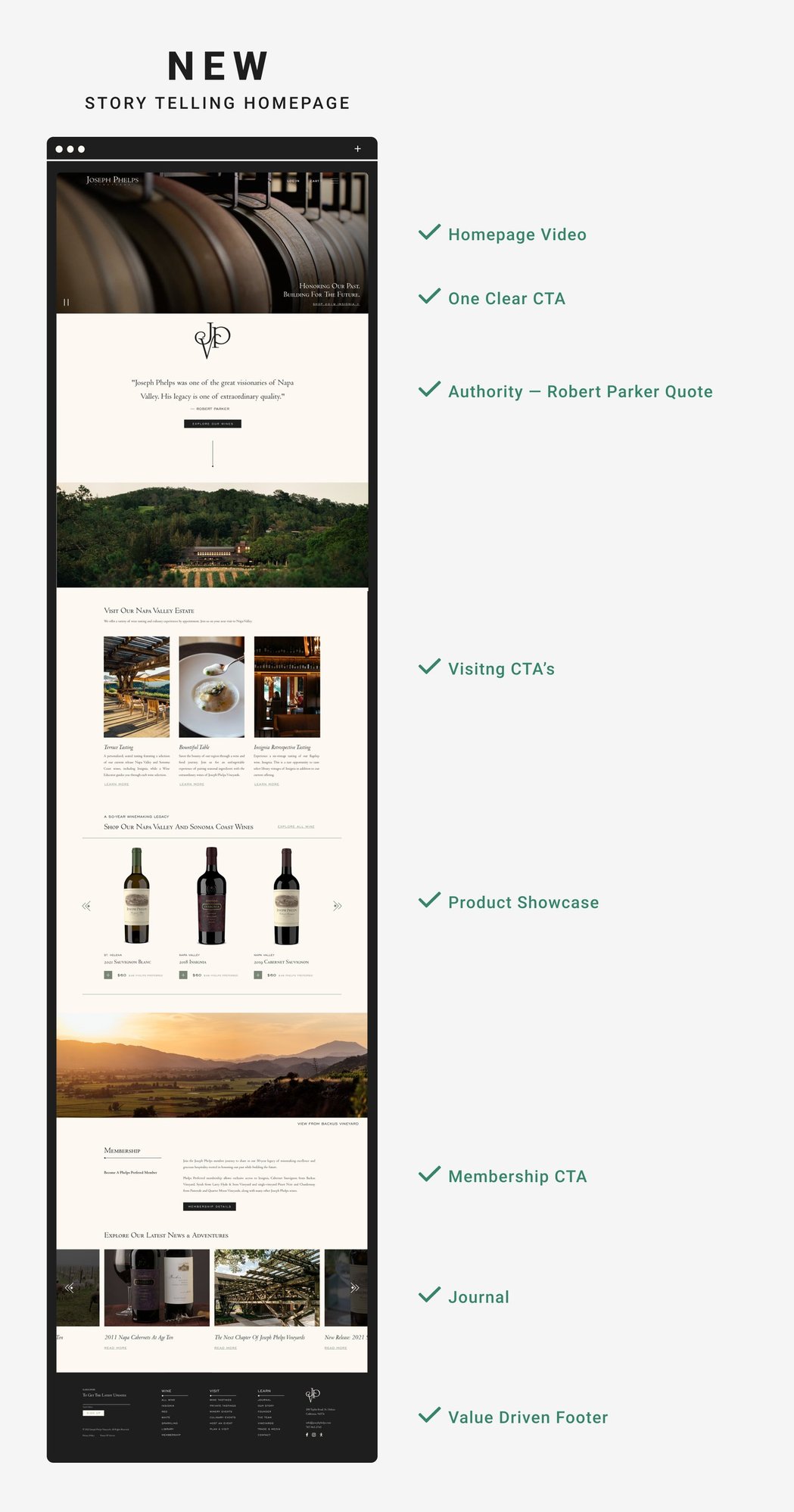
Our new homepage prioritized the winery’s goals with clear calls to action throughout the page. We used an immersive video at the top of the homepage to draw the user in and guide them down the page to learn more about the brand. With such a rich legacy, we decided an authoritative quote from Robert Parker was stronger to lead with then a self-congratulatory statement. The homepage is instantly shoppable with featured products and experiences. Users can purchase and book without clicking deeper into the site.
Shop
E-COMMERCE DRIVEN DESIGN
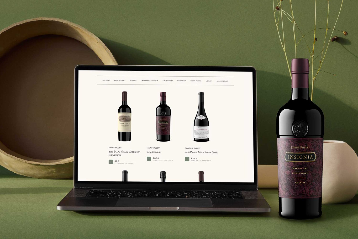
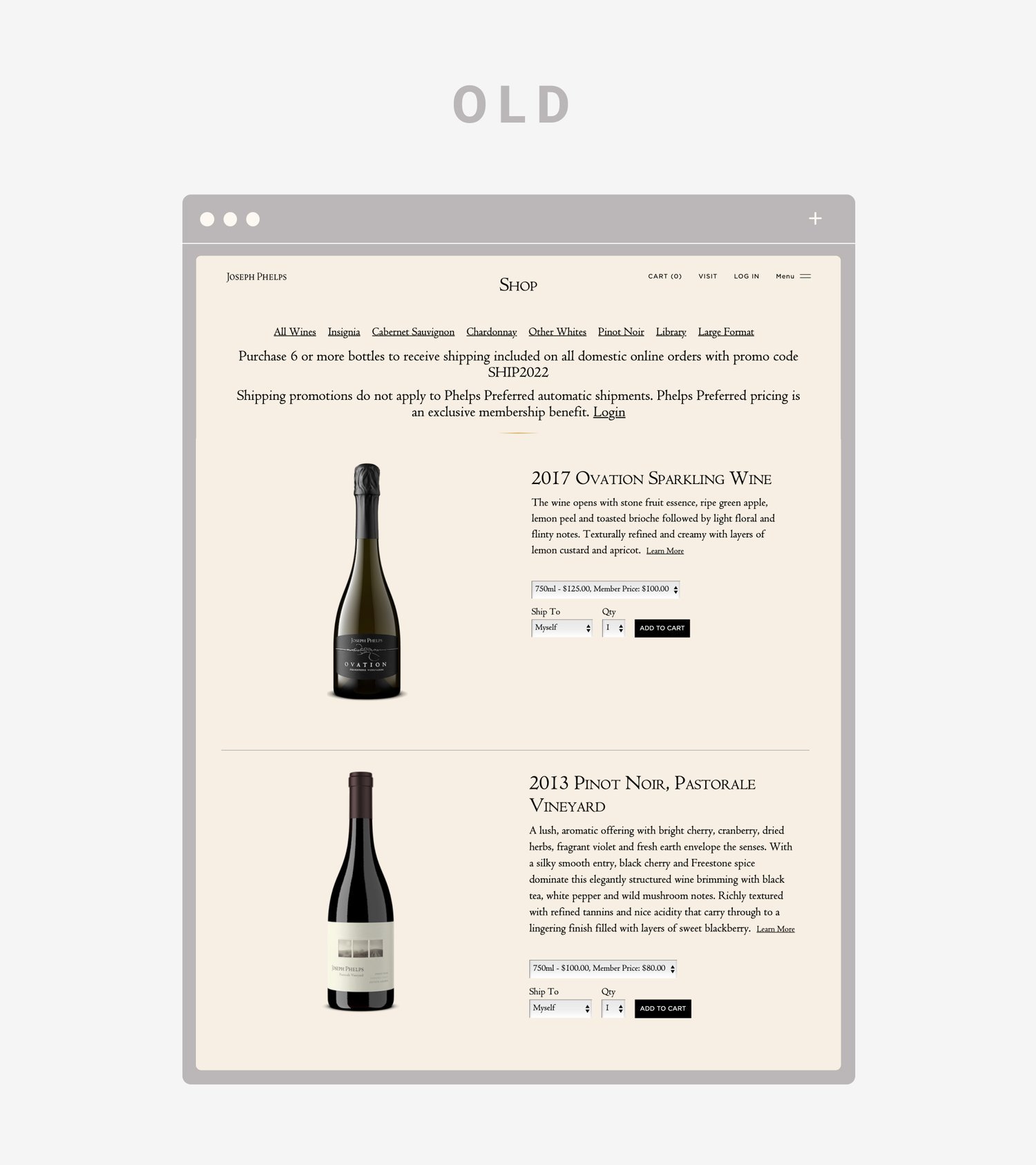
Joseph Phelps Vineyard’s number one goal was to improve ecommerce. They selected Commerce7 as their ecommerce provider due to its streamlined checkout experience and advanced features. Their old shop was very busy and hard to navigate. Each wine had its own row which led to lots of scrolling. The pricing was not displayed clearly and it lacked any lifestyle content which studies have shown leads to higher conversion.
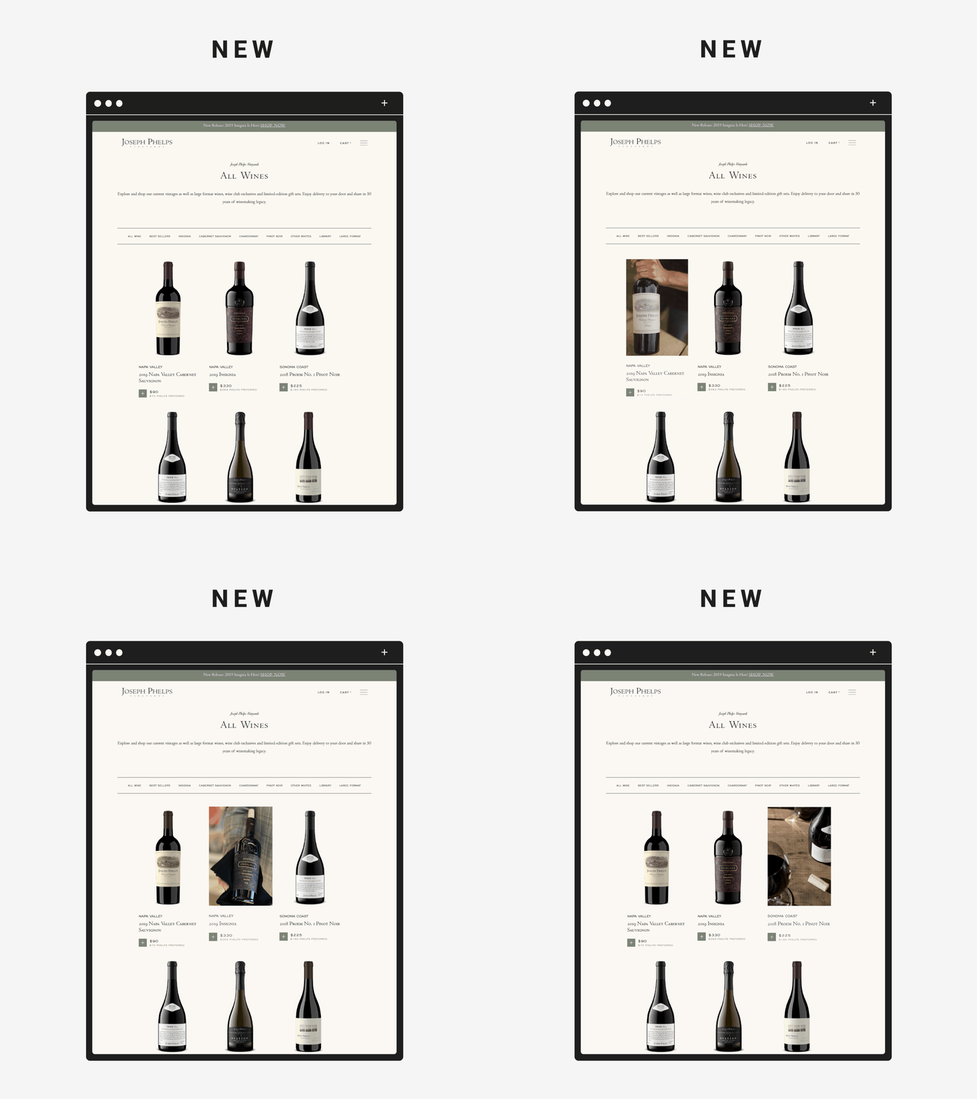
The new shop is clean and elegant. The category navigation is streamlined and sticks out on the page to help users better navigate. Wines are clearly laid out with three SKUs per row and show a custom plus button to add wine to cart. Both retail and member pricing is clearly displayed to avoid confusion. Lifestyle images are shown when you hover over the wine to provide intrigue and elegance.
Product Detail Page
PROVIDING CLEAR USER JOURNEY
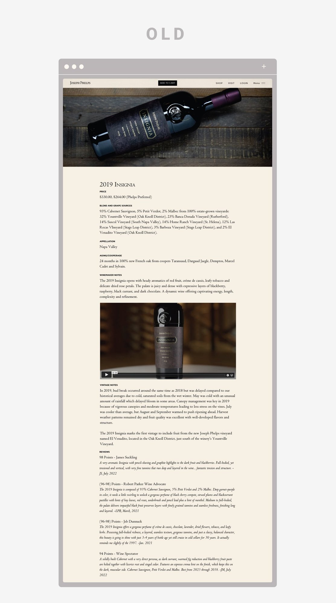
Insignia is one of the most iconic wines from Napa Valley and deserves an iconic page. The old site was too copy focused and lacked intrigue. Wine is one of the most stimulating sensory experiences and we wanted to create a page that echoed that.
Our new page leads off with a image slideshow on the left of the page. As the user scrolls, the content on the right sticks to the page and the three images slide by to showcase lifestyle content. Key stats about the wine were broken up into bullets to make the page more scanable.
Below that, the video draws the user in with a diamond cutout, which when clicked on reveals a full video behind it. Other content sections are broken up with photos to make the page more digestible. With all of this content, the page becomes longer, so we added a sticky add to cart button which appears on the top of the page as the user scrolls down to ensure they are always driven to convert.
