When choosing a font, dress for the occasion. Deciding on a font is similar to deciding what outfit to put on when you
get up in the morning. It all depends on the occasion. If I’m going to get up and go to work, I am going to wear something business professional. If I’m getting up to spend the day at the mall, I am going to wear something I am going to be able to shop around in comfortably all day. The same decision process happens when you are getting ready to choose a font. When writing a resume or business document, you don’t want to use the fun and loopy fonts, you want something that is going to look professional. The serif and sans serif fonts may not seem that much different at first glance, but their differences are very much present.
Serif:
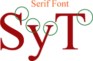
This is the font you want to use for print work. This type of font has the small lines that tail from the edges of the letters. These little tails are called serifs. The serifs make it easier for our eyes to flow through horizontal reading quickly, such as how we do while reading a book. Serif is heavily used for the body of the text. It is less likely to cause fatigue on the eyes compared to sans serif. One of the most common serif fonts is the classic Times Roman.
Sans serif:
This is the font you want to use for the web. Sans serif doesn’t have the serifs on the edges of its letters. Computers have a lower resolution than printed works, which is why sans serif is better to be seen on a computer screen. Sans serif is better in small sizes than serif. The sans serif font is able to survive reproduction and smearing because of its simple form. Sans serif is typically used for emphasis. When enlarged the font stands out while still retaining its same general shape. Sans serif is the font to use for children who are learning how to read. The simplicity of the letters makes it easily recognizable for the children. One of the most common sans fonts is the popular Arial font.
So before you choose your font remember to think about:
- Where the font is going to be used
- Its legibility for the readers
You want your readers focusing on your message, not on what kind of font you chose to use. Remember, it’s never a bad thing to stick with the classics.